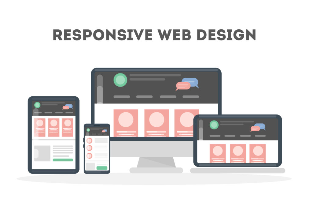
Mobile-First Design
We design websites that look perfect on mobile devices, ensuring a smooth experience for every user.
Cross-Device Compatibility
Your website will work seamlessly on desktops, tablets, and smartphones without any issues.
SEO-Friendly Structure
Our responsive designs follow SEO best practices to improve your website ranking on search engines.
Modern UI/UX Design
We create visually appealing and easy-to-use designs that keep visitors engaged and convert them into customers.
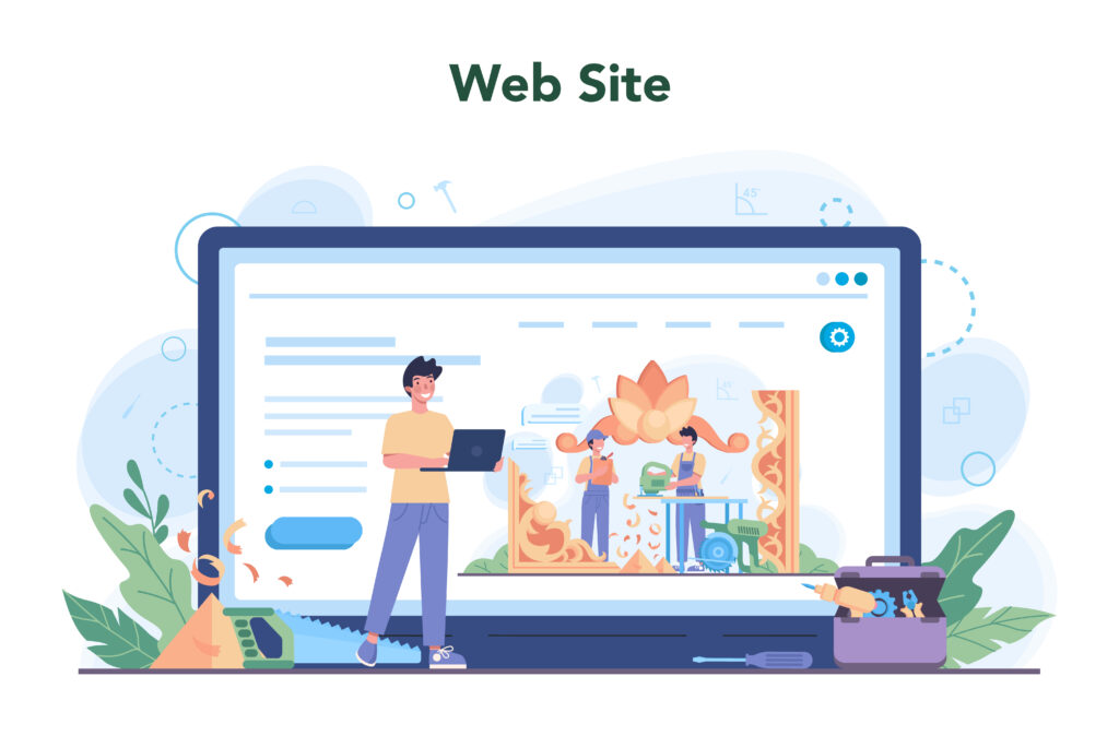
Website Layout & UI Optimization
We create clean, modern, and user-friendly layouts that adapt perfectly to all screen sizes, improving user experience and engagement.
Responsive Framework & Mobile Setup
We build mobile-first, responsive websites using modern frameworks to ensure smooth performance across all devices and browsers.
Performance & Speed Optimization
We optimize images, code, and loading speed to deliver fast, high-performance websites that improve SEO and user satisfaction.